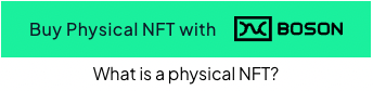
The Commit button widget
Integrating ‘Commit’ functionality using the Boson Commit button
With the Boson Commit button, sellers can allow their buyers to commit to a Boson offer on their own domains.
Clicking on the button as shown above displays the Commit widget.
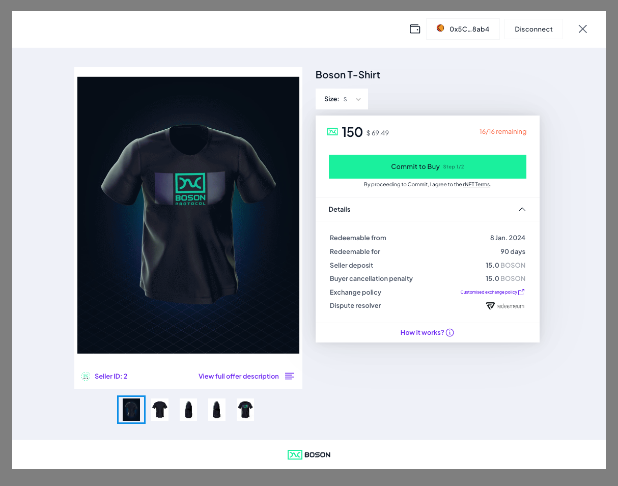 The Commit widget allows buyers to:
- show details about the specified product
- connect their Web3 wallet
- commit to the product (after they have connected their wallet and have enough funds)
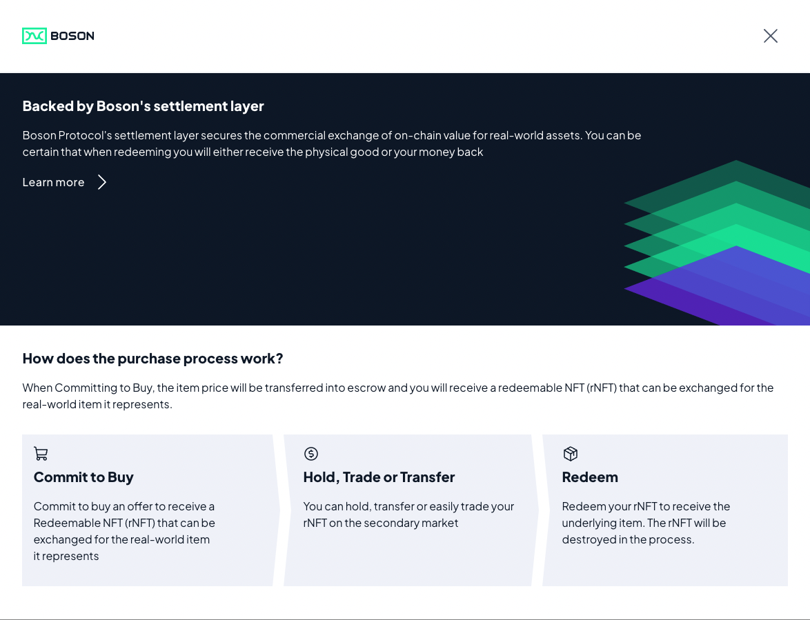
If they click on the "What is a physical NFT?", customers will see a purchase overview:
How to integrate the Boson Commit button?
To integrate the Boson Commit button, all a seller needs to do is:
- Add the following
<script>entries, either in<head>or<body>of their website:
<script async type="text/javascript" src="https://widgets.bosonprotocol.io/scripts/zoid/zoid.min.js"></script>
<script async type="text/javascript" src="https://widgets.bosonprotocol.io/scripts/commit-button.js"></script>
- Add following code wherever you want to display the commit button:
<div id="container"></div>

<script>
  const instance = CommitButton({
    configId: "testing-80002-0",
    productUuid: "086b32-3fcd-00d1-0624-67513e85415c",
    sellerId: "138",
    modalMargin: "2%",
    lookAndFeel: "modal",
    disabled: false,
    buttonStyle: {
      minWidth: "100px",
      minHeight: "100px",
      shape: "rounded",
      color: "white"
    },
    onGetDimensions: function (dimensions) {
      const { offsetHeight, offsetWidth } = dimensions;
      document.querySelector(
        "#container"
      ).style.height = `${offsetHeight}px`;
      document.querySelector(
        "#container"
      ).style.minWidth = `${offsetWidth}px`;
    }
  });

  instance.render("#container");
</script>
You can also update properties dynamically with updateProps(updatedPropertiesObject):
<script>
    let disabled = false;
    const instance = CommitButton({
      /* ... */
      disabled,
    });

    instance.render("#container");
    function toggleDisableState() {
      disabled = !disabled;
      instance.updateProps({ disabled });
    }
  </script>
  <button onclick="toggleDisableState()" style="margin: 20px;">toggle disable state</button>
The Commit button has been created with zoid so you can use their drivers to have components in your favorite framework.
Commit Widget Parameters
The following parameters configure the widget and the button. They must be passed as properties of the CommitButton call. For instance:
<script>
const instance = CommitButton({
  configId: "testing-80002-0",
  productUuid: "086b32-3fcd-00d1-0624-67513e85415c",
  sellerId: "138",
  modalMargin: "2%",
  lookAndFeel: "modal",
  disabled: false,
  buttonStyle: {
    minWidth: "100px",
    minHeight: "200px",
    shape: "rounded",
    color: "white"
  },
  onGetDimensions: function (dimensions) {
    const { offsetHeight, offsetWidth } = dimensions;
    document.querySelector(
      "#container"
    ).style.height = `${offsetHeight}px`;
    document.querySelector(
      "#container"
    ).style.minWidth = `${offsetWidth}px`;
  }
});
</script>
| Parameter | Required | Default Value | Purpose | Example |
|---|---|---|---|---|
| configId | yes | none | the Boson Protocol environment the widget is linked to (see Boson Environments) | "production-137-0" |
| sellerId | When offerId is not used | none | specifies the Boson Seller ID that publishes the Product being offered with the plugin. | "2" |
| productUuid | When offerId or bundleUuid are not used | none | specifies the ProductUUID of the Product being offered with the plugin. | "2540b-1cf7-26e7-ddaf-4de1dcf7ebc" |
| bundleUuid | When offerId or productUuid are not used | none | specifies the BundleUUID of a Phygital Offer being offered with the plugin. | "4d5262-28cf-d860-06f-6406bd65fa10" |
| offerId | When sellerId/productUuid or sellerId/bundleUuid are not used | none | specifies the ID of the Offer being offered with the plugin. Note: an offer ID is the low-level identification of the Boson Offer on-chain, while a Product can match several offers, like several variants (size, color, ...)). | "1099" |
| account | none | the address of the wallet the widget should accept. When specified, the user can't connect any other wallet that the one specified. This parameter is optional and can be used if you want to prevent the user to use the Commit Widget if they don't connect with the given wallet. | "0x023456789abcd0213456789abcd213456789abcd" | |
| lookAndFeel | no | "modal" | the look and feel for the Widget ("regular" or "modal"). When set to "modal", allow to define a margin around the widget to be appearing like a modal popup. | "modal" |
| modalMargin | no | "2%" | the margin to apply around the widget when lookAndFeel is set to "modal" | "5%" |
| buttonStyle | no | none | the allowed styles of the commit button | { minWidth: "100px", minHeight: "200px", shape: "rounded", color: "white"} |
| buttonStyle.minWidth | no | none | the commit button min width | "100px" |
| buttonStyle.minHeight | no | none | the commit button min height | "200px" |
| buttonStyle.shape | no | "sharp" | the commit button shape: "sharp","rounded" or "pill" | "rounded" |
| buttonStyle.color | no | "green" | the commit button color: "green","black" or "white" | "white" |
| onGetDimensions | no | none | the callback that is called with the actual dimensions of the commit button in its iframe | onGetDimensions: ({offsetHeight, offsetWidth, boundingClientRect}) => console.log({offsetHeight, offsetWidth, boundingClientRect}) |
Discover more...
The Commit Widget is part of the React Component library from Boson Core Component you can discover on this Storybook page. Also, you can play around with the Commit button itself Storybook page.
You can find an example HTML file which embeds the commit button on the the widgets subdomain: https://widgets.bosonprotocol.io/scripts/commit-button-example.html